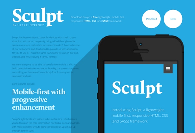
Sculpt is a lightweight, mobile first, responsive HTML, CSS and SASS framework. It has been written to cater for devices with small screen sizes first, with more complexity being added through media queries as screen real-estate increases. With three grid sizes (732px, 960px and 1140px) built in and active depending on your device’s screen size you can be sure your content will be well presented no matter the conditions.
Sculpt’s stylesheets are written to be mobile-first, which allows you to focus on the core information needed at such a small size, with more complex layouts being introduced as you move up through screen sizes
Sculpt allows you to keep your page free from inline styles by utilising a library of flexible css declarations that really do what they say on the tin. Want to make something a container, give it the class container. Want a div and a ul to both act as columns and sit next to each other, then give them both the class column. Want something to be four column widths wide? Then it needs a class of four. You get the picture.
[button color=”blue” size=”medium” link=”http://www.heartinternet.co.uk/sculpt ” target=”blank” ]Sculpt[/button]


