Not every information about a venture can be, communicated verbally. You always need some documentation to convey the details in a professional manner. A brochure is an informative paper foldable into various templates, formats, and leaflets.
A brochure is often, termed as your first chance to create a lasting impression on your client or customer. It can convert sales through spreading the word about various offers. You need a professional brochure design to have a designated image in the mind of the reader. It sets up how your audience perceives your venture and relate to it.
In this article, we’ll talk about the tips on how to come up with a professional brochure design.
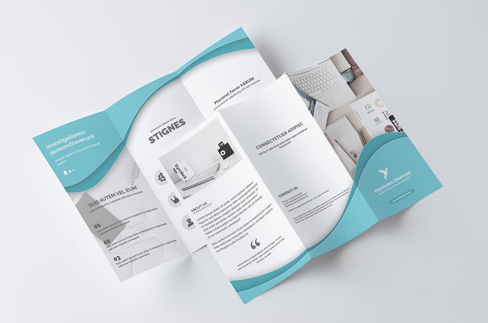
1. Layout Scheme For Your Brochure
Don’t try to complicate things up in your brochure. You may create some puzzles out of your creativity which is difficult to decipher by the reader. He may put it down out of frustration. It is better to keep things simple. You should consider folding options that match the brand.
For example – a premium car company like Audi or Bentley won’t like to fold the brochure. They’ll prefer a booklet style brochure with minimal text and premium images.
The color and font schemes should be consistent. Sans-serif font style is, preferred for descriptive text purposes. It makes up for a professional brochure design. Some last-minute changes may destroy the visual appeal of your flyer.
You should try to look luxurious by using matte black and navy contrasted by whites and silvers.
Pre-plan the sections in the brochure. Try not to scatter the descriptions and the dedicated sections. For example – a salon brochure should contain information like section name, service, description closely.
2. Image Selection For Your Brochure
Images speak for themselves in a business flyer. A professional brochure must contain a minimal amount of text. It should contain pictures which are powerful enough to express. Try to put an effort in collecting appropriate images. It’s always better to avoid stock images and capturing your own for the brochure.
Your images should be in highest possible resolution. Play with the settings to attain perfect pictures. Eliminating red-eye, and bokeh on the subject for sharper images is, preferred for a brochure. Try isolating the product, so that nothing more steals the limelight. A perfect angle describing the 3D nature of the object sums up to a perfect image.
3. Written Content
A professional brochure design contains a minimal amount of text. Still, the text is an integral part of the professional flyer. You can’t compromise here. Images speak for themselves but sometimes you need to spread the message through the word. Powerful images along with quality content can engage the readers in a beneficial way.
While you care about text, don’t try to add too much of it. A lot of content might disinterest the readers. Be on point and don’t give away too much in text. Let the reader explore more.
4. Choosing The Stock
Keeping designing standards is necessary. You added high-resolution images in the brochure. But the quality of image won’t be, projected if the paper quality is not good. Choose the stock paper wisely.
Lux paper can be, used for classic products. It’s a thick, triple-layered card. It gives the perfect feel for the paper. It is mainly, used for old cars, hotels, and watches.
Constellation Snow paper is, meant for deluxe brochures. The white uncoated paper has linen effect embossed on it.
Silk coated paper calls for a luxurious finish. It is the perfect match for contrasting outfits. It brightens the colors of your brochure.
Uncoated paper is best for projecting a modernish look to your brochure. It makes the objects appear flatter, sharper, and vivid.
5. Choosing The Print Technique
A poor print may take away the premium finish away from the reader’s hands. Always prefer LED-UV printing, especially for the aforementioned stocks. It leaves no markings or blemishes, and ink remains intact. The drying process is quick, and the resolution remains as designed. This printing goes hand in hand with uncoated stock.
Always try to be unique and creative without losing the class. It is what it takes for a professional brochure design. Powerful images, sans-serif fonts, consistent color scheme, minimal content, proper stock, and print will help you achieve your goal.


